Elements catalog
Complete reference guide for all Fundraise Up Elements with examples and use cases.
Fundraise Up provides more than 20 Elements divided into six categories: Buttons, Data displays, Forms, Links, Lists, and Overlays. Each section below details how specific Elements work, shows how they appear on your website, and explains common use cases to help you choose the right Elements for your needs.
Button Group
The Button Group displays multiple donation amounts. Its layout adapts to your page design, arranging buttons in either a single row or multiple rows and columns based on available space.
Users who click any amount are redirected to the Checkout Modal of the associated campaign. If the modal isn’t enabled, they’ll be taken to the Campaign Page.
Element preview:
Common use cases:
- Campaign landing pages when you want to suggest specific amounts.
- Blog posts about particular fundraising needs.
- Impact-focused pages where amounts correspond to specific outcomes.
- Emergency or time-sensitive campaign pages.

Example of how a Button Group can look on a website
Donate Button
Use the Donate Button in your website’s header navigation and other key areas. It includes a heart icon and subtle animations to draw attention. When clicked, it opens the Checkout Modal of your campaign, or redirects to the Campaign Page if the modal isn’t enabled.
Element preview:
Common use cases:
- Primary donation button in website navigation.
- Call-to-action button on campaign landing pages.
- Footer donation option.
- Blog post call-to-action.

Example of how a Donate Button can look on a website
Floating Button
The Floating Button is a dynamic element that stays fixed in the corner of your website, moving with visitors as they scroll. It activates a popup with an engaging, AI-generated call to action after they’ve spent time exploring your content. When clicked, it opens your campaign’s Checkout Modal or redirects to the Campaign Page if the modal isn't enabled.
AI plays a key role in this feature by generating donation messages that align with your campaign’s content. If multiple languages are enabled, the AI automatically creates messages in all active languages, eliminating the need for manual customization. While the AI-generated messages come from your campaign descriptions and Ask page content, you can still customize the button’s appearance, such as its size and color.
The button appears one second after page load and displays donation popup at two key moments: after 10 seconds of page viewing, or when desktop visitors move their cursor toward the browser’s address bar (indicating they might leave).
The popup shows only once per site visit and won’t appear again after a successful donation.
Element preview:
Common use cases:
- Zero-effort integration: insert the element and let AI optimize supporter engagement automatically.
- Mobile websites where corner buttons feel natural.
- Content-heavy pages that need minimal donation elements.
- Blog posts and articles where scrolling is common.

Example of how a Floating Button can look on a website
Fundraisers Button
The Fundraisers Button lets visitors start fundraising campaigns for your organization. When clicked, it launches the fundraiser creation process. Enable the Allow to join teams option to let visitors either start their own fundraiser or join an existing team.
Element preview:
Common use cases:
- Peer-to-peer fundraising campaign pages.
- Community event pages.
- Birthday fundraising promotions.
- Team fundraising initiatives.

Example of how a Fundraisers Button can look on a website
Image Card
The Image Card combines visuals with a donation button to showcase specific projects or campaigns. You can add a custom image, title, and description. When visitors hover over the chevron symbol next to the title, a slide-up animation reveals the longer description.
Visitors who click the Image Card will be redirected to the campaign’s Checkout Modal. If the modal isn’t enabled, they’ll be taken to the Campaign Page.
Element preview:
Common use cases:
- Featured projects on your homepage.
- Program-specific donation opportunities.
- Impact stories with immediate donation option.
- Campaign spotlight sections.
- Preview displays for donation premiums (such as t-shirts or water bottles).

Example of how Image Cards can look on a website
Sticky Button
The Sticky Button appears outside your website’s layout at a higher visual layer. It attaches to the edge of your browser window and stays visible as visitors scroll up or down. The button’s appearance can be controlled with a Scroll offset setting, which determines how far a visitor must scroll before the button smoothly glides into view. This helps organizations avoid overwhelming visitors with multiple donation prompts immediately upon page load, instead waiting until they’ve shown engagement with your content.
Like the Donate Button, it includes subtle animations and opens your campaign’s Checkout Modal when clicked. If the modal isn’t enabled, it redirects to the Campaign Page instead.
Element preview:
Common use cases:
- Long-form content pages.
- Impact story pages.
- Blog posts.
- Campaign updates where you want donation option always available.

Example of how a Sticky Button can look on a website
Data Elements
Data Elements help visitors visualize the impact of their donation through interactive displays and real-time updates.
Donor Map
The Donor Map creates an interactive visualization of where support comes from. Visitors can click numbers on the map to see details of donations from that area. The map displays data from your last 10,000 supporters and can be configured to show your preferred geographical area.
This Element doesn’t include a donation button.
Element preview:
Common use cases:
- Homepage to showcase global reach.
- Impact reports to demonstrate community breadth.
- Annual reports to visualize supporter geography.

Example of how a Donor Map can look on a website
Goal Meter
The Goal Meter, also known as a live thermometer, shows your campaign’s progress toward its target amount using a progress bar. The display updates every minute with new donation totals and includes a count-up animation.
Element preview:
You can track progress by total Donation amount, Total supporters, or Recurring supporters.
To include donations from other sources, use the Add amount option when tracking by amount. When tracking by supporters, you can manually add offline supporters using the Add supporters field.
If tracking by amount, you can also choose to Show number of supporters. If tracking by Total supporter count, you can choose to Show donation amount.
If your campaign has matching funds, you can configure this in the Matching funds field by checking the Set multiplier checkbox and entering your ratio. Here are some common examples:
- For a 1:1 match (sponsor contributes $1 for every $1 donated), set the multiplier to 2.
Example: A $30 donation becomes $60 toward your goal.
- For a 2:1 match (sponsor contributes $2 for every $1 donated), set the multiplier to 3.
Example: A $30 donation becomes $90 toward your goal.
You can enter any multiplier value that matches your campaign’s matching ratio. This option is especially useful for campaigns that involve corporate sponsorships, challenge grants, or programs where donations are multiplied to encourage giving.
Refunded donations are excluded from the Goal Meter and are not counted in sums or totals.
You can link multiple campaigns to a single Goal Meter. When you do, the Goal Meter will display the combined totals from all linked campaigns.
Common use cases:
- Capital campaign landing pages.
- Emergency fundraising campaigns.
- Challenge grant campaigns.

Example of how a Goal Meter can look on a website
Stat Counter
The Stat Counter displays your campaign’s total impact with an animated count. It can show one of the following metrics:
- Goal amount
- Amount raised
- Number of supporters
- Number of donations
- Number of recurrings
- Monthly value of recurrings
Like the Goal Meter, it includes an Add amount option to manually include donations from other sources.
Refunded donations are excluded from the Stat Counter and are not counted in sums or totals.
The Stat Counter doesn’t include a donation button.
Element preview:
Common use cases:
- Homepage statistics.
- Campaign milestones.
- Annual fundraising achievements.
- Monthly recurring donation growth.
- Supporter number highlights.
Example of how a Stat Counter can look on a website
Form Elements
Form Elements create shortcuts in the donation process and let you customize the checkout experience.
Donation Form
The Donation Form embeds your checkout form directly within your webpage layout. Our highest-converting Element, it works especially well on landing pages that receive traffic from social media, search engines, and ad campaigns. When you update the connected campaign's settings, the form updates automatically.
When visitors click the main button (labeled Donate and Support by default, but customizable), the Checkout Modal will open. If only the Campaign Page is enabled for the associated campaign, visitors will be redirected to that page instead.
If your Donation Form is connected to a campaign with daily donations, you can use the Show end date dropdown to control whether supporters see the campaign’s end date. Learn more about setting end dates for daily donations.
Element preview:
Common use cases:
- Landing pages for marketing campaigns.
- Dedicated donation pages.
- Campaign-specific fundraising pages.
- High-traffic pages from social media or search.
- Email marketing destination pages.

Example of how a Donation Form can look on a website
Donation Levels
Donation Levels display various giving options with customizable descriptions. You can use it to create supporter tiers (for example, Gold, Silver, and Bronze) with corresponding donation amounts. The Accent dropdown lets you highlight either the donation amount or the level name.
If you want to give supporters more flexibility, enable the Allow supporter to change the selected amount option. This lets them adjust the suggested values before donating. If this option is disabled and the prefilled amount is invalid — for example, missing, zero, or below the campaign’s minimum amount — the amount becomes editable during checkout.
All Donate buttons open the Checkout Modal with the chosen amount prefilled. If only the Campaign Page is enabled for the associated campaign, visitors will be redirected to that page instead.
Element preview:
Common use cases:
- Membership programs.
- Annual giving campaigns.
- Supporter recognition tiers.
- Impact-based giving options.
- Monthly giving programs.

Example of how Donation Levels can look on a website
Impact Slider
The Impact Slider visually connects donation amounts to their impact. You can create up to six customizable values that supporters can slide between.
Enable the Allow supporter to change selected amount option to let them supporters the suggested values. If this option is disabled and the prefilled amount is invalid — for example, missing, zero, or outside allowed limits — the amount becomes editable during checkout.
The donate button opens the associated campaign’s Checkout Modal. If only the Campaign Page is enabled for the associated campaign, visitors will be redirected to that page instead.
Element preview:
Common use cases:
- Program-specific fundraising.
- Visible impact demonstrations.
- Project-based fundraising.
- Educational institution campaigns.

Example of how an Impact Slider can look on a website
Simple Form
The Simple Form offers a simplified version of the Donation Form with just a donation amount input and a customizable Donate button. When clicked, the button opens the associated campaign’s Checkout Modal. If only the Campaign Page is enabled for the associated campaign, visitors will be redirected to that page instead.
Element preview:
Common use cases:
- Blog post sidebars.
- Newsletter signup confirmation pages.
- Thank you pages.
- Quick donation options.
- Mobile-optimized pages.

Example of how a Simple Form can look on a website
Link Elements
Link Elements generate URLs that can be used anywhere to direct supporters to your checkout or fundraising form.
Donate Link
The Donate Link lets you create trackable links to your campaign that can be used on your website, in social media, or anywhere the Fundraise Up installation code isn’t present. The link can also be applied to your existing donate buttons or links. This preserves your website’s exact styling, while still launching the Fundraise Up checkout form when clicked.
The Donate Link adapts based on the context:
- If only a Campaign Page is enabled, the link opens that page.
- If only the Checkout Modal is enabled, the link opens the modal.
- If both are enabled, the link will:
- Open the Checkout Modal on your website.
- Open the Campaign Page from external sources like direct links or emails.
1https://donate.ropsi.org/-/XWZBZUBBExample of a Donate Link
Common use cases:
- Email campaigns.
- Social media posts.
- SMS fundraising messages.
- Partner websites.
- Web advertising campaigns.
Fundraisers Link
The Fundraisers Link allows supporters to start fundraising campaigns across various channels. When clicked, it opens the fundraiser creation process.
Common use cases:
- Event participant communications.
- Team fundraising recruitment.
- Birthday fundraising promotions.
- Community challenge campaigns.
- Volunteer engagement programs.
- Web advertising campaigns.
1https://donate.ropsi.org/-/XTDDUDDFExample of a Fundraisers Link
QR Code
The QR Code Element generates scannable codes that link to your campaign. You can customize the code with an image at its center. The QR Code can also be embedded on your site, where it becomes clickable, in addition to its QR code functionality.
The behavior of the QR code adapts based on the context:
- If only a Campaign Page is enabled, scanning the QR code will open that page.
- If only the Checkout Modal is enabled, scanning the QR code will open the modal.
- If both are enabled, scanning the QR code will:
- Open the Checkout Modal when scanned on your website.
- Open the Campaign Page when scanned from external sources like direct links or emails.
Common use cases:
- Print materials.
- Event signage.
- Direct mail campaigns.
- Business cards.
- Conference materials.

Example of how a QR Code can look on a billboard
List Elements
List Elements help showcase supporter involvement, building trust and credibility for your fundraising efforts.
Recent Donations
Recent Donations shows real-time donations, excluding anonymous ones. New donations appear about 30 seconds after they’re made. You can configure which supporter details to display, including name or initials, amount, location, comment, and date.
Element preview:
Common use cases:
- Campaign landing pages.
- Community fundraising events.
- Giving day campaigns.
- Challenge grant drives.
- Telethon-style fundraisers.

Example of how Recent Donations can look on a website
Top Fundraisers
The Top Fundraisers Element works as a leaderboard, highlighting successful peer-to-peer fundraisers by displaying up to 10 top fundraisers. Leaderboards can foster competition among fundraisers, helping elevate overall fundraising efforts. It can also include a search box, allowing supporters to find themselves or others in the list.
Element preview:
Common use cases:
- Event participant recognition.
- Team fundraising leaderboards.
- School fundraising competitions.
- Community challenge campaigns.
- Athletic fundraising events.

Example of how Top Fundraisers can look on a website
Top Locations
Top Locations displays geographic donation rankings with three options: Top Countries, Top Regions (for USA, Canada, and Australia), or Top Cities (worldwide or by country).
Element preview:
Common use cases:
- International fundraising campaigns.
- Regional chapter competitions.
- Community giving challenges.
- Geographic impact reporting.
- Multi-location events.

Example of how Top Locations can look on a website
Top Supporters
The Top Supporters Element displays your campaign’s leading supporters within your chosen date range, ranked by donation amount. This leaderboard fosters competition, motivating supporters to increase their contributions and drive better fundraising results.
You have control over the level of information displayed for each supporter.
Element preview:
Common use cases:
- Supporter recognition programs.
- Annual campaign highlights.
- Capital campaign updates.
- Leadership giving circles.
- Membership level recognition.

Example of how Top Supporters can look on a website
Currency display options
All four List Elements include a Show currency dropdown menu, where you can choose how donations are displayed:
- Set currency: Select a specific currency (for example, US dollars) to automatically convert and display all donations in that currency.
- Detected currency: Donations are displayed in the currency local to the site visitor (for example, British pounds for visitors in the UK), based on their geolocation.
- Actual currency: Displays donations in the original currency the donation was made in.
All Elements, except Top Fundraisers, can include a Donate button. This directs supporters to the selected campaign’s checkout. If the campaign has both a Checkout modal and a Campaign Page enabled, the Checkout modal will open.
Overlay Elements
Overlays are a no-code way to add a fundraising call-to-action to your website. They appear on top of your content and are managed directly in the Dashboard, which makes them quick to deploy.
Message Bar
The Message Bar displays announcements across the width of your site. It can include a heading, message text, and a call-to-action button that directs visitors to your checkout form.
You can configure the Message Bar to appear at the top or bottom of the page, and choose to show it on mobile, desktop, or both.
You can also set a start and end date for the Message Bar. It will appear at midnight on the start date and disappear at 11:59 PM on the end date, based on your organization’s local time zone.
Element preview:
Common use cases:
- Time-sensitive campaign announcements.
- End-of-year giving deadlines.
- Emergency fundraising appeals.
- Special campaign launches.
Example of how a Message Bar can look on a website
Popup
The Popup creates campaign announcements with a title, message, image, and donation button.
Like the Message Bar, you can schedule when it shows using start and end dates. It will appear at midnight on the start date and disappear at 11:59 PM on the end date, based on your organization’s local time zone.
Element preview:

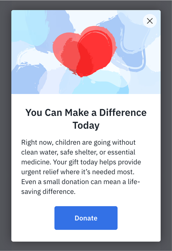
Common use cases:
- New campaign launches.
- Limited-time matching gifts.
- Special fundraising events.
- Year-end giving promotions.
- Crisis response fundraising.
Example of how a Popup can look on a website
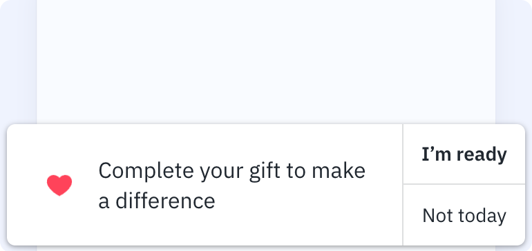
Reminder
The Reminder shows a popup to supporters who either leave checkout form without donating or return after abandoning a previous donation attempt. This Element requires visitors to accept functional cookies in your website cookie banner.
The Reminder will appear after the Checkout Modal opens and closes. If you click “Not today,” the Reminder won’t show again. Clicking “I’m ready” reopens the Checkout Modal, but if it’s closed, the Reminder won’t appear again. Each time the Donate button is clicked, a new session begins, and the Reminder will display after the Checkout Modal closes during donation.
Element preview:

Common use cases:
- Donation abandonment recovery.
- Return visitor engagement.
Example of how a Reminder can look on a website
URL control configurations
In the Dashboard, each Overlay element includes a Visibility tab where you can control where the element appears on your website. By default, the element is shown on every page. To change that, use the Show element at these URLs and Never show element at these URLs fields.
These fields support pattern matching using asterisks (*), allowing you to include or exclude specific paths, subdirectories, or even subdomains.
How URL control works
- If both fields are empty, the element appears on all pages.
- If a URL is listed in both fields, the “Never show” rule takes priority.
- Always include the full URL, starting with
http://orhttps://. - Always include a trailing slash, even for the root directory — for example, https://example.com/.
- Each field supports up to 20 URLs. To stay within this limit, use wildcards and block rules instead of listing every individual page.
Using wildcards (*)
The asterisk acts as a wildcard and can be used in different parts of the URL — after directories, after partial words, and even before the domain for subdomain matching.
| Pattern | Matches |
|---|---|
| https://example.com/* | All pages under the root of example.com, such as /about/ or /donate/thank-you/ |
| https://example.com/about/* | All pages under /about/, such as /about/team/ or /about/history/ |
| https://example.com/about* | Any page that starts with /about, including /about, /about-us, /about_team, /about/, and everything under it |
| https://*.example.com/ | Any subdomain of example.com, such as blog.example.com or donate.example.com |
| https://*.example.com/donate* | Any /donate page on any subdomain, such as donate.example.com/donate-thank-you |
| https://example.com/ | Only the root page |
| https://example.com/about/ | Only the exact /about/ page |
You can combine allow and block rules for more control. For example:
- Show element at these URLs: https://example.org/donate*
- Never show element at these URLs: https://example.org/donate/thank-you/
This setup shows the element on all donation pages except the thank-you page.
Next steps
Want more control over how Elements appear on your site? Read the CSS guide for Elements to learn how to position, align, and style them to match your website layout.
Social Proof
Social Proof shows incoming non-anonymous donations in near-real-time with popup alerts. These alerts highlight recent supporter activity and include a Donate button for quick action. You can choose what supporter information to display — first name, last name, or initials — making the experience both engaging and customizable.
When a supporter clicks on a Social Proof notification, they are directed to the campaign where the original donation was made.
If you want all Social Proof notifications to send supporters to a single campaign (for example, your main donation page), you can limit the Social Proof to only display donations from that campaign.
Element preview:
Common use cases:
Example of how a Social Proof can look on a website